
At the conclusion of our last casebook series, we had looked at the main options for scanning a patient with an OCT and concluded with an assessment of a routine patient, HH (Optician 24.7.20). In this next series we will focus on the data gained from a range of patients and begin with a look at HH, a young patient about whom there were no concerns and who had OCT scanning as a matter of routine.
Line Scans
The horizontal line scans for the right eye (figure 1) and the left eye (figure 2) offer a clear view of a cross section of each retina and represent a healthy and normal appearance. The visibility of posterior vitreous, particularly around the temporal disc area, and the obviously thick section of choroid and choriocapillary tissue underneath the retina remind us that this is a younger patient (28 years). Layers tend to thin with age, and vitreous becomes more fluid and eventually invisible on OCT scan.
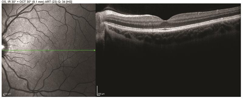 Figure 2
Volume Scans
The multiple line scans of a volume scan allow the instrument to measure the thickness and volume of scanned tissue over a specific area. This can then be presented as a thickness map (figure 3). Both eyes are shown here, and at the top we see a colour thickness map with individual measurements for ETDRS sectors to the right of each. The colour coding of the map reveals thicker tissue areas as red and thin areas (such as the fovea here) as blue. The black numbers represent tissue thickness in microns and is the thickness between the two layer limits shown in the cross section image below; in this case, I have chosen the inner limiting membrane and Bruch’s membrane to give me the full retinal thickness, but different layer limits may easily be selected. The red numbers represent the volume of each sector. Showing thickness data for each eye side by side makes it easier to notice any asymmetry.
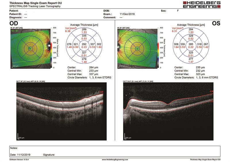 Figure 3
Another useful way of analysing thickness data is to look for any asymmetry of thickness, either between the two eyes or within the eye itself. This is shown in figure 4 as an asymmetry map for patient HH. Here we see the thickness maps for each eye again, this time with individual values overlaid on the colour map. To the right of this is a grid showing any points of difference in thickness between the two eyes represented as a grid. A completely white grid would suggest each eye is completely the same thickness, a rare occurrence. The darker the square, the bigger the thickness difference in this area from the other eye. This format is useful for showing clearly oedema in one eye, for example, or extensive, asymmetrical thinning due to disease.
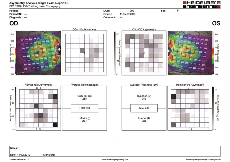
Figure 4
The lower grid is a hemisphere analysis grid. Loss of neural tissue due to a disease such as glaucoma will tend to show asymmetry within an eye due to the fact that the nerves are distributed above and below a separating horizontal midline. This is the basis for the Glaucoma Hemifield Test value on a visual fields analyser, as any obvious asymmetry of thickness above and below the horizontal midline will be indicative of early glaucoma , so would show here as clear distinction of thickness above and below the horizontal midline or of sensitivity on a GHT. In HH, such asymmetry cannot be seen.
RNFL Scan
The results of the annular scan of the disc are typically displayed as shown in figure 5. This is a composite result sheet showing the disc analysis for each eye and a central column showing inter-eye differences. Under the disc view and cross-section image for each eye, you can see a graph and two circle charts. The graph shows the thickness of the retinal nerve fibre layer at each point around the disc from temporal and passing anticlockwise back to temporal again. The values for HH are the black line while the green line is the average thickness from a normative dataset. As expected for a healthy patient, the RNFL is thickest inferiorly, then superiorly (following the ISNT rule) and this is why this graph is often described as a ‘twin peaks’ graph. The two circle charts beneath show thickness values (black) and variation from normative data (green).
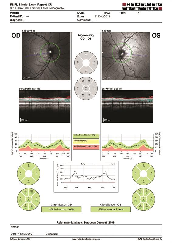 Figure 5
In the next case book we will focus on inter-eye symmetry.
- The material presented in these casebooks is based on use of the Heidelberg Spectralis but is designed to cover generic principles. Individual details of scanning and data presentation will differ depending on your OCT. The author and colleagues have no commercial interests in Heidelberg Engineering.